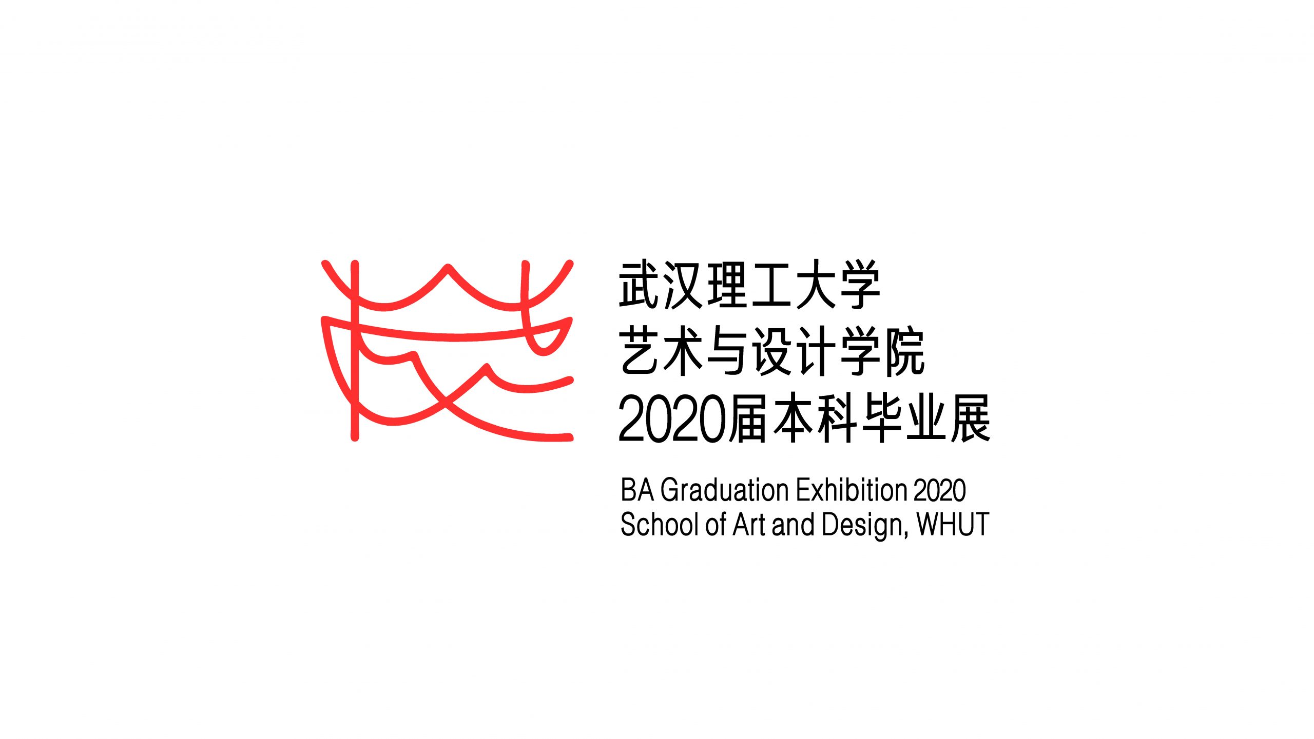
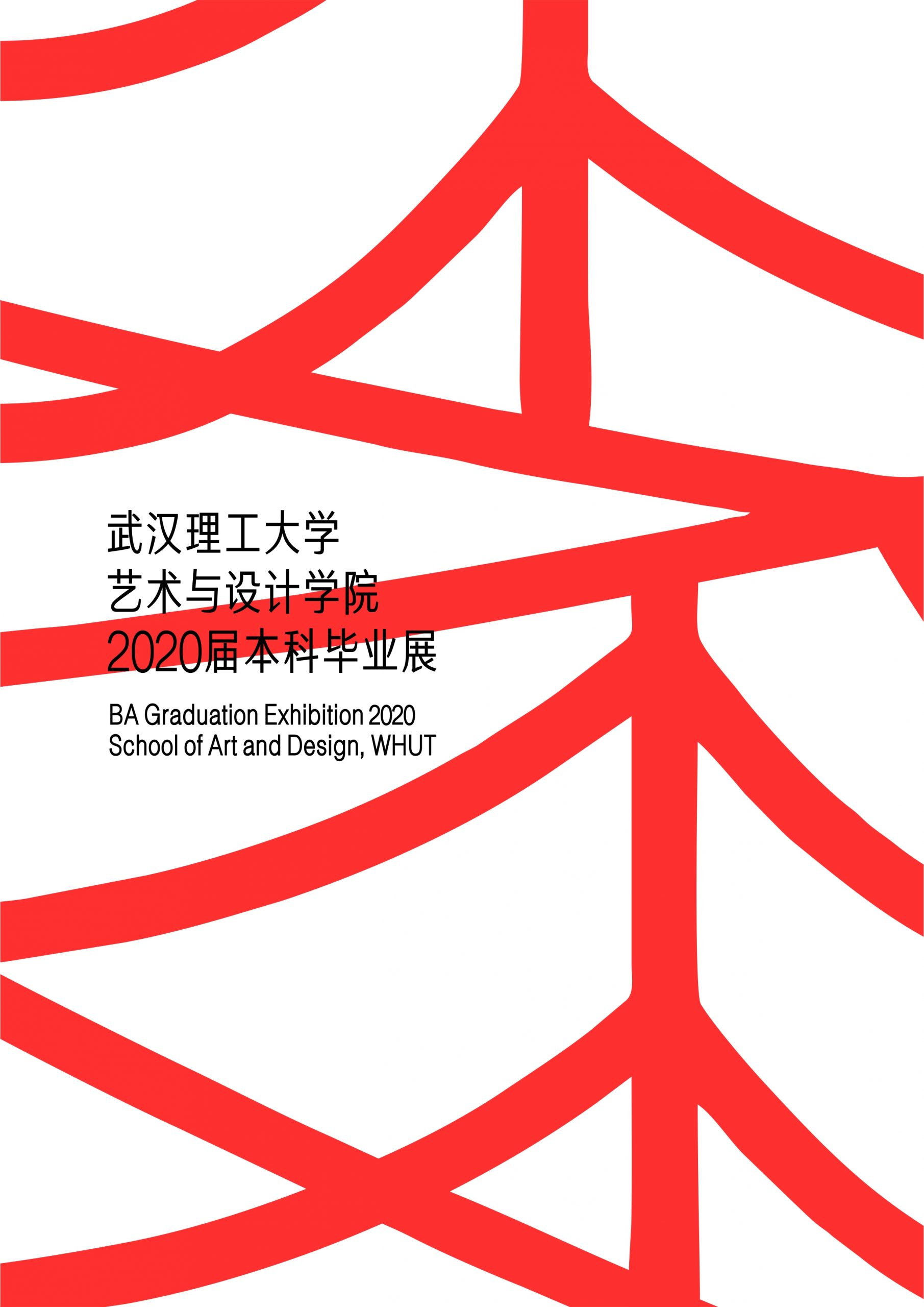
武汉理工大学2020年本科毕业设计展主视觉
Graduation Design Exhibition of Wuhan University of technology 2020 Key Visual
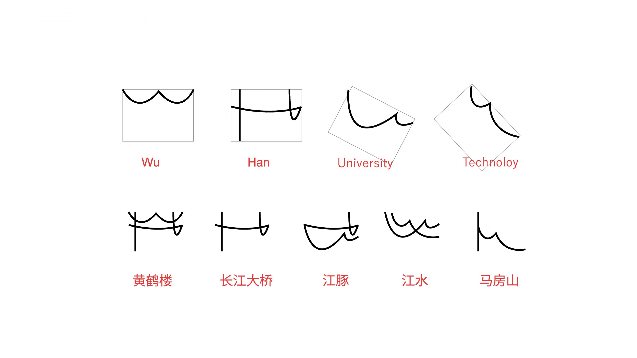
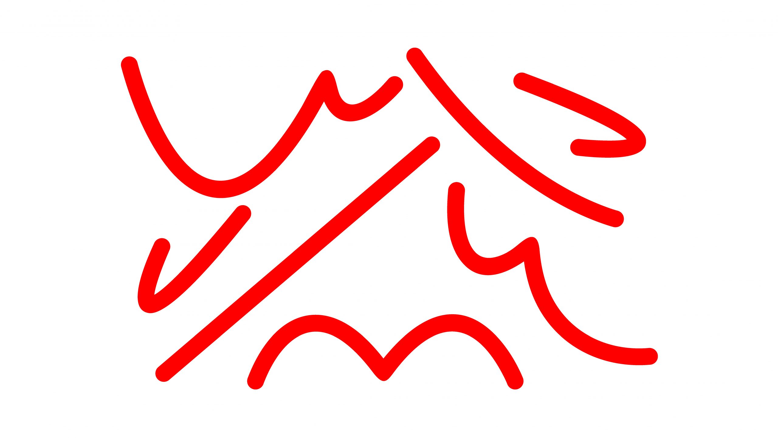
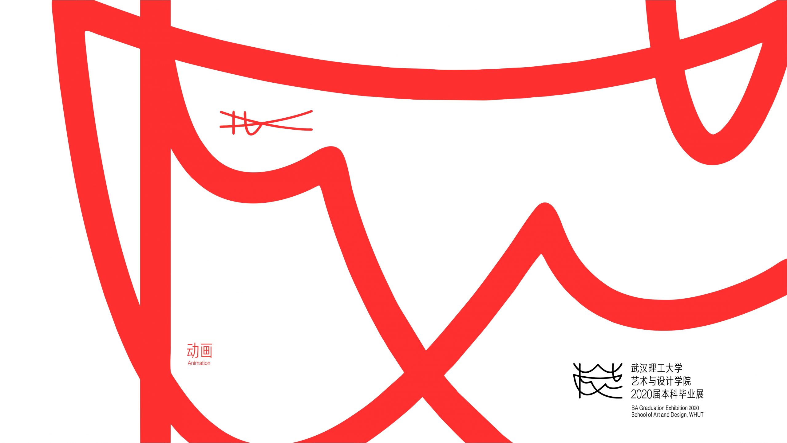
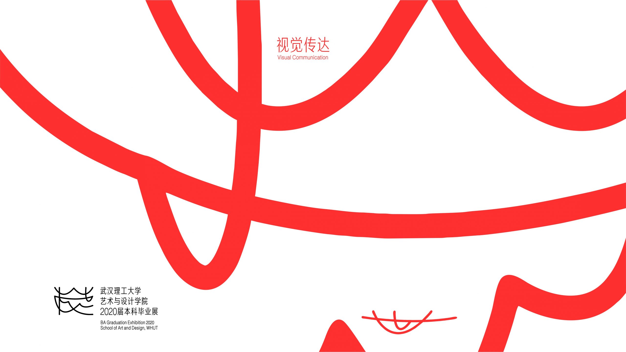
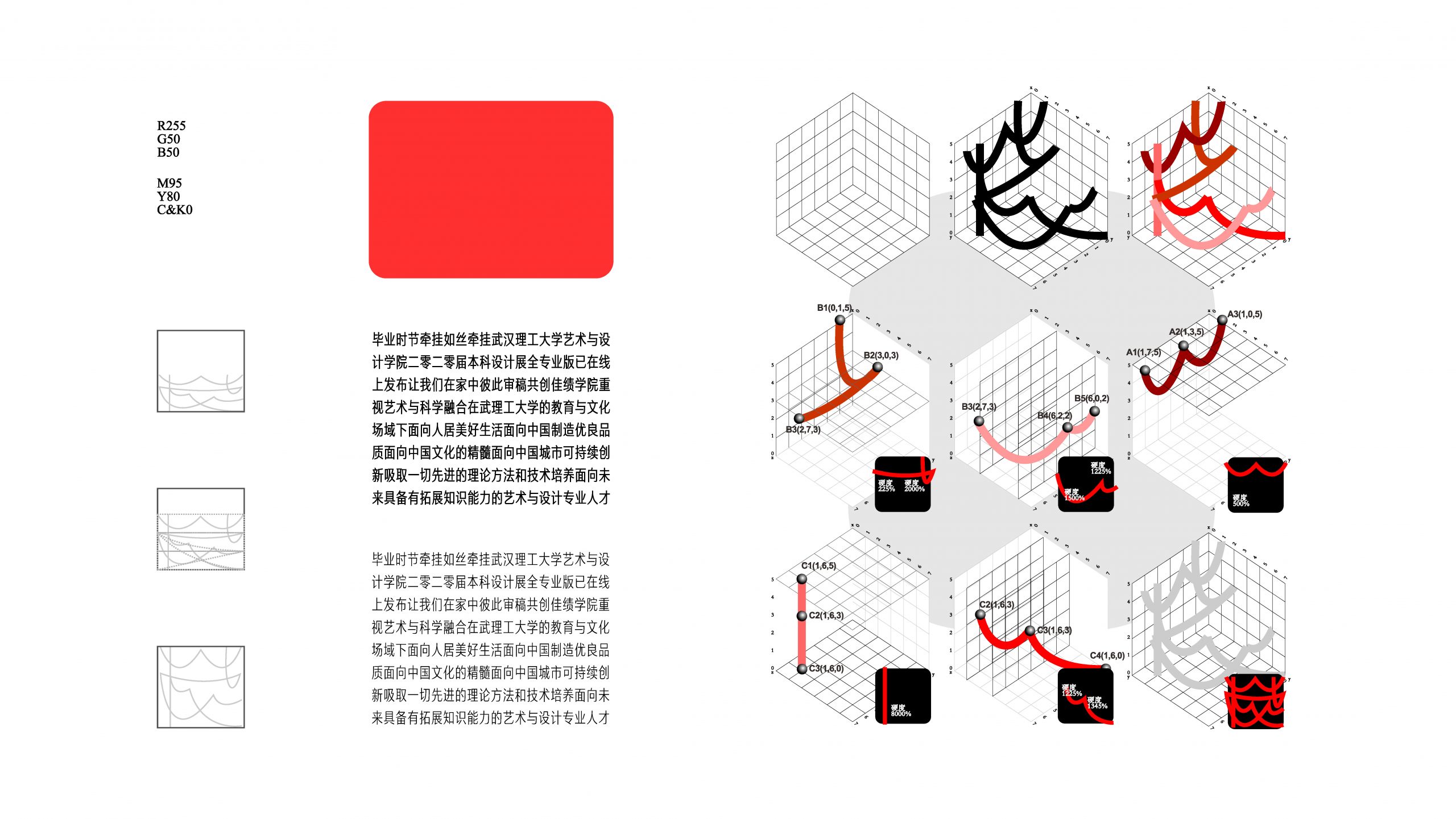
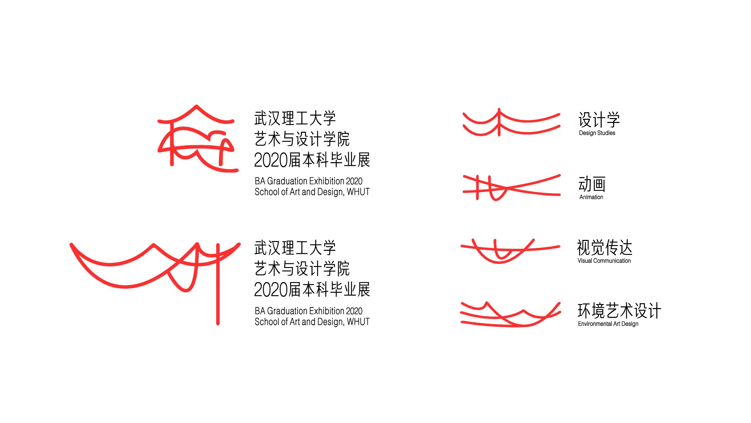
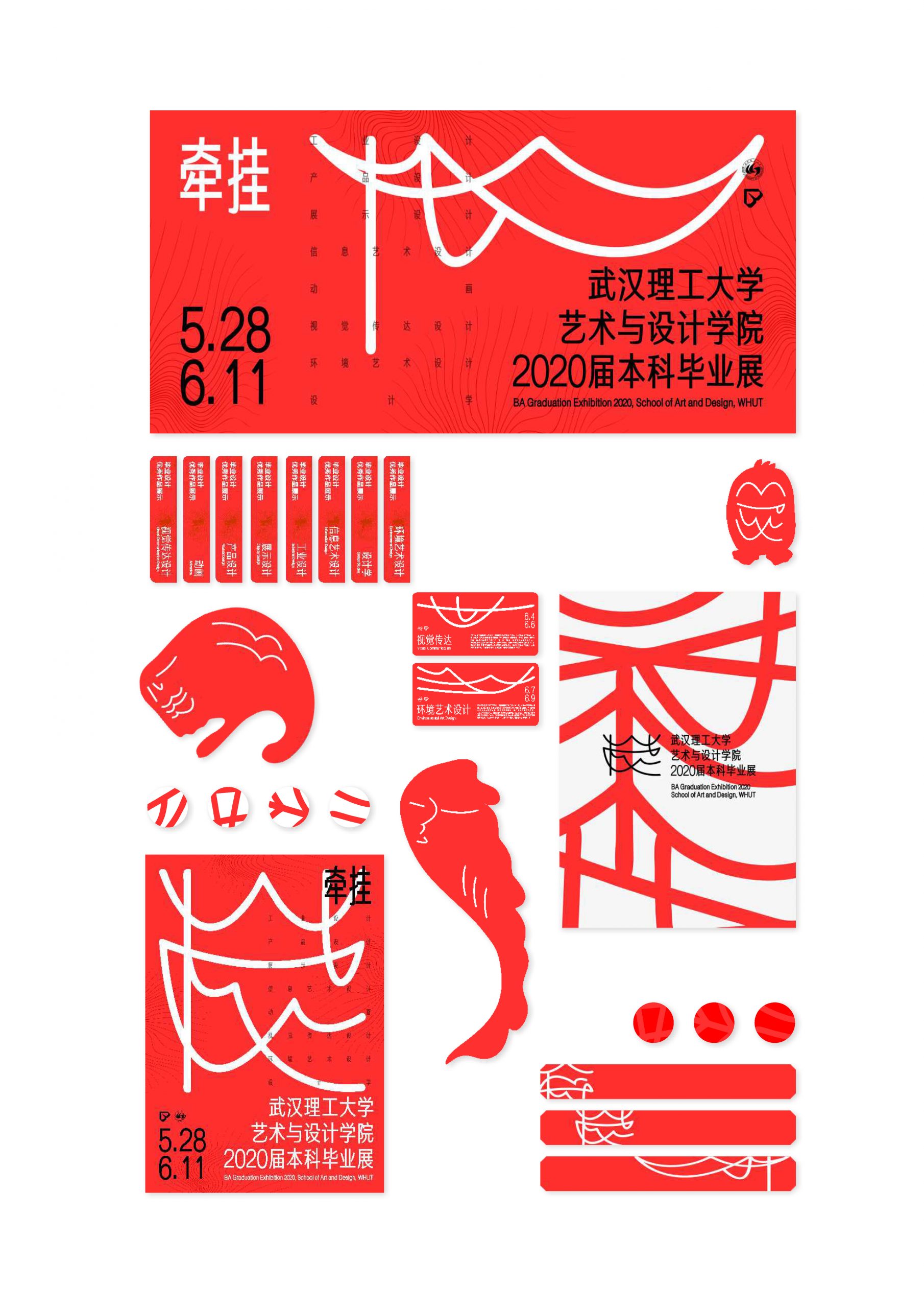
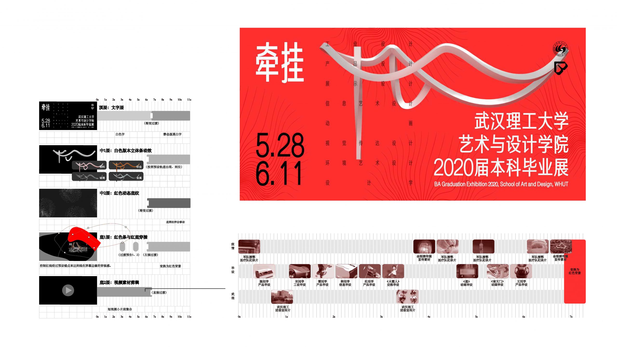
逢武汉疫情,2020毕设展提案以思线红线为核心。红线一方面有欧阳修“双眸望月牵红线”的广义情感联结,另一方面有红线寓意吉祥的说法。项目提取线的可延展性与随意性构成了草稿的最初概念–图案四周的边框为空间接触点,形成武汉理工大学缩写“WHUT”,在此基础上行生武汉元素。
The proposal for the 2020 Graduation Exhibition is centered on the element of red thread-the thread of longing. The project extracts the malleability and arbitrariness of the line, to form the initial concept of the draft – the border around the pattern is the spatial point, forming the abbreviation of Wuhan University of Technology, WHUT, from which the following elements are derived Wuhan element.
版权协议
Copyright
All design concepts and creative work contained herein are the property of the project team and were created by us. The client retains the sole right to approve, reject, or modify any element of this proposal for final implementation.
客户
Client
Wuhan University of Technology
主视觉设计
KV Design
Wang Rui
动态设计
Dynamic Design
Wang Rui, Han Yiwei
建模
3D Modeling
Gong Xuan
指导
Instructor
Fang Wei, Wang Kaiping
时间戳
Time Stamp
2020/6/11